6 Resource Centers Reviewed – Pros, Cons, and Takeaways
Resource centers are all the rage these days. “Publish great resources!” they say. “Get new leads!” they promise. “It will do wonders for your SEO too!” right? Some resource centers rock every area, from lead gen to SEO. Others flop. And there are plenty in between. Below are a few of my favorites, why I like them, and numerous ways they could get even better.
Moz Learn
Moz’s learning center, located at http://moz.com/learn/seo, is packed with the many resources they offer for anyone interested in SEO. It provides easy access to their flagship resources, and guides users to additional resources based on pain points. 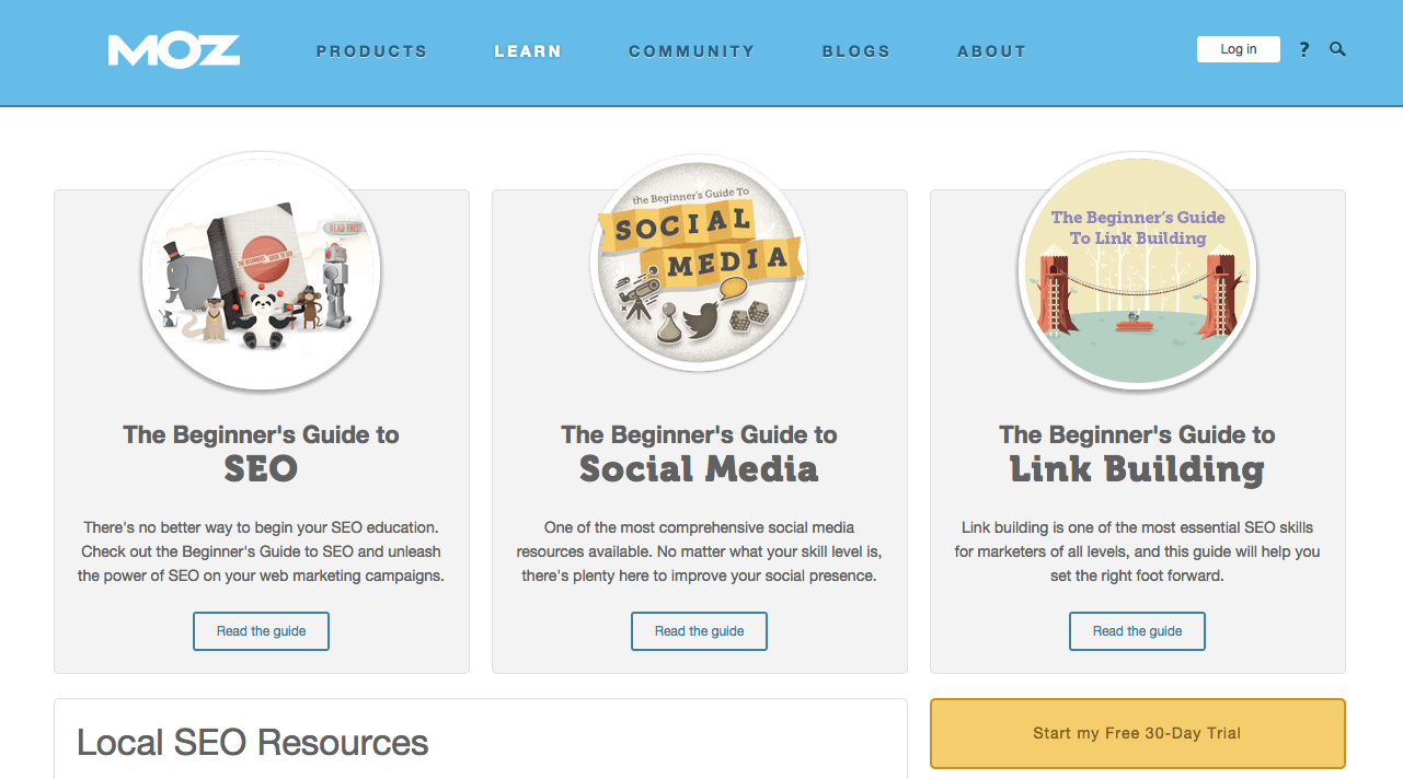 What I love about it:
- Users know where to start – The user is immediately led to three big resources that address three big needs: SEO, Social Media, and Link Building.
- Lots of ungated content – There is tons of ungated content here. Some of it has a small price tag, but most is still ungated. That creates lots and lots of SEO value.
What I’d change about it:
- Overwhelming presentation – There is a lot of content linked to this first page. A user might easily be overwhelmed at the sheer volume of content, and be paralyzed by options as a result.
- Little ungated content – I know, I know, but there’s a balance. Some gated content is acceptable, even to users. Brands with zero gated content are missing a big opportunity to collect email addresses so they can better serve their audience.
Moz has built an amazing resource center, but if it were mine I’d make it work just a little bit harder by gating more of the content.
Marketo Resources
Marketo provides some of the best competitive marketing automation software available today, and their team is definitely all in when it comes to content marketing. You can find their resource center at https://www.marketo.com/resources/. 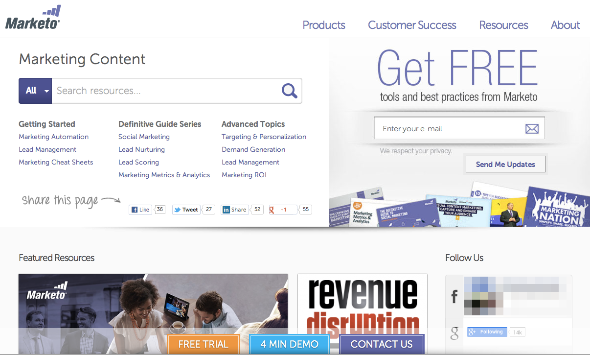 Disclaimer: Marketo is a Profound Strategy client. We work with their team to continue improving their content and SEO strategy, but we did not do the visual design of their resource center. Why I like it:
- Users know where to start – The home page quickly draws the user to key topics and important resources to keep him/her from feeling overwhelmed at the volume of content.
- Effective mix of gated and ungated content – Each of the key landing pages start with big, authoritative pieces of ungated content. Each of those same key landing pages draws the user down the page with ungated content, to gated content at the bottom – giving away a lot of their expertise, but also very strategically collecting emails.
- Social proof – There are a lot of social trust signals throughout the Marketo resource center. The “Follow Us” sidebar panel demonstrates their large social following. Rollovers on individual pieces humbly report hundreds or thousands of shares, and social widgets on each page count shares on each channel.
 Why I still want to tweak it:
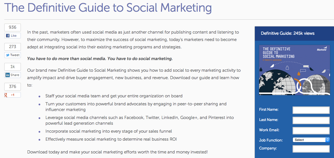
- Clear next steps – The resource center homepage is very busy. It could be simplified to clarify and highlight those top issues more clearly.
- Generic subscription CTA – The email subscription box is prominent, but it’s generic. Other sign-up opportunities throughout the site have a value proposition attached, and I’d really like to see more value offered here as well.
Lots of good stuff going on here. Once a resource center gets this big, however, it might be time to simplify and it’s definitely time to let it work for the brand as well as the user.
Grasshopper Resources
Grasshopper is a Boston-based company that works hard for entrepreneurs — from their innovative phone product, “the entrepreneurs phone system,” to their very resourceful website and resource center: http://grasshopper.com/resources/. 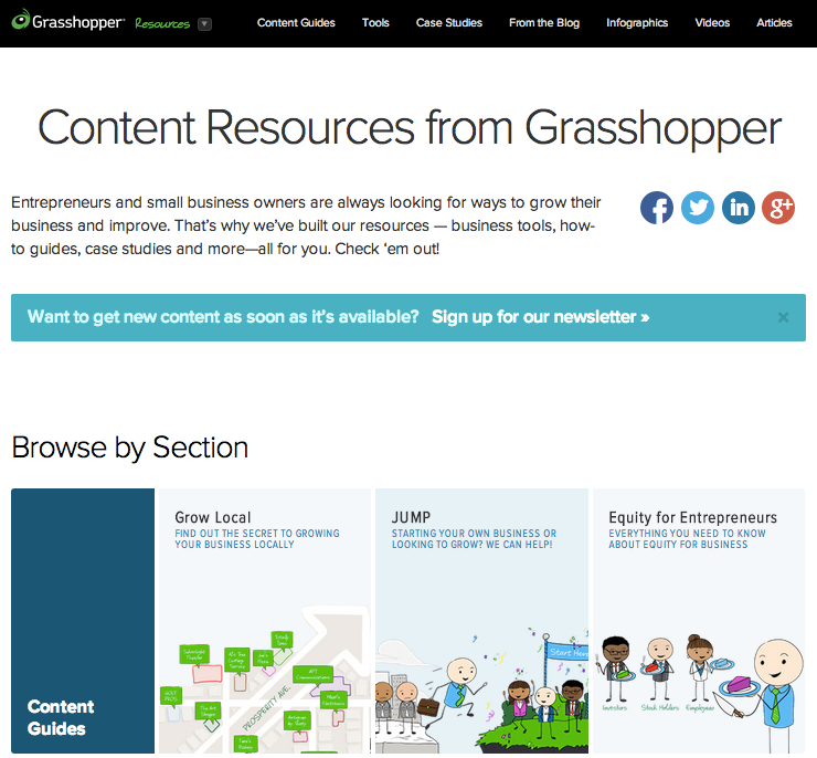 Disclaimer: Grasshopper is also a Profound Strategy client. Similarly to Marketo, we help with their content and SEO strategy, but have not had a hand in the visual design of their resource center. Pros:
- Rich SEO – Grasshopper’s resource center hosts lots of deep, multi-page resources. These huge content pieces create a great user experience — because a visitor can easily jump around to new, interesting content — and lots of SEO value.
- Social proof – Social media share counts at the top of each page, and quotes from other users who are pleased with the resources at the bottom of each page, sandwich their content with trust signals.
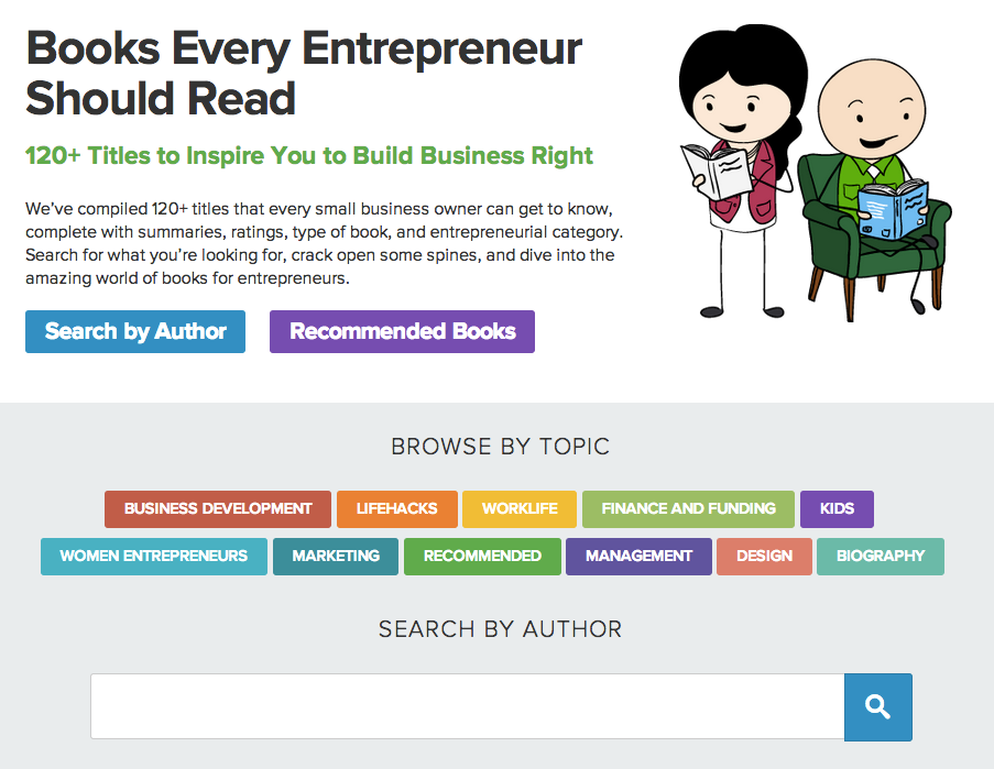
- Custom search – There are some unique, custom tools that allow users to browse recommended books, and search via tags and categories. That’s pretty cool.
 Cons:
Cons:
- No social proof – …on the home page. I’d love to see Grasshopper add some counters for social shares, downloads, etc. to the main resource center page.
- Structure – Resources are structured by type, not theme, which doesn’t offer as much benefit to the user. Most visitors probably don’t show up thinking, “I need an eBook.” They arrive thinking, “I need to know about local marketing.”
Grasshopper has put together a resource center that is both helpful and unique in a lot of ways, which is refreshing as resource centers gain popularity. A little bit of restructuring could help them really win the day.
Traacker Resources
Traacker is all about helping marketers compete in a digital world through influencer marketing — from their software to their content: http://traackr.com/resources/. 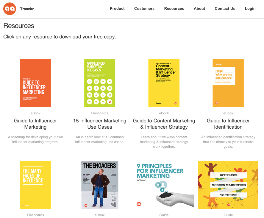 Awesome factors:
- Simple aesthetics – Traacker’s resource center is about as clean and easy to navigate as they come. Nothing about this resource homepage is overwhelming.
- Focused – The topical focus here is very clear. Resources are built around influencer topics, narrowed into their target market.
Un-awesome factors:
- Lazy layout – It’s clean, but it’s just a big list. Personally, I’d like to see something more creative and visually engaging in case I have a hard time choosing which resource to look at.
- Lite pages – Individual download pages are very light on content, which is a huge SEO opportunity missed.
The simple design of Traacker’s resource center works for now, but as their library continues to grow, a grid-list of resources is going to hinder the user experience. And while their laser-like focus is great, it could work so much harder for their SEO strategy.
KISSmetrics Marketing Guides
KISSmetrics delivers web analytics to help brands of all sizes connect metrics to their bottom line. They live and breathe metrics for their audience as shown in their own resource center: https://blog.kissmetrics.com/marketing-guides/. 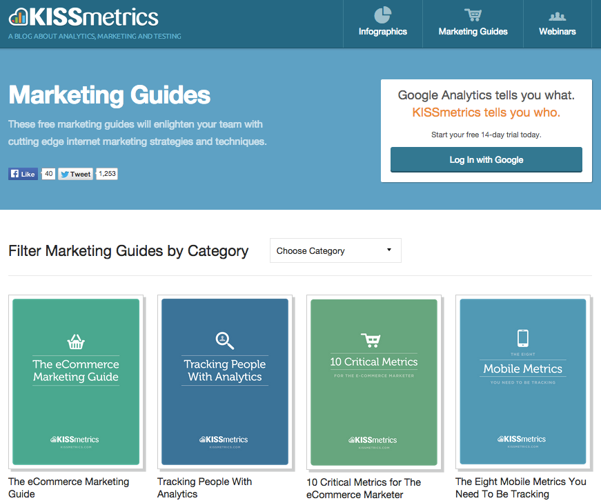 Do as they do:
- Call to action – There is a very clear and prominent next step/call to action right there at the top. It’s value is clearly stated.
- Personal – The signature at the bottom of each download page is a very personal touch. It exposes their brand voice and personality beautifully.
But not completely:
- New windows – Download pages load in new tabs or windows, which breaks up the user experience.
- Lazy layout – Like Traacker, the resource center is just one big list, and this one has next to no real images – just lots of text and color. Some visually engaging graphics would really help to pull the user in.
The KISSmetrics resource center is off to a good start, but could definitely benefit from a little structural work.
Ideas to Get Started
Resource centers can deliver enormous SEO value, but it’s not a guarantee. A careful mix of gated and ungated content is just one area that can help (or sink) the SEO traffic of your resources. I’ll post again soon with some more-hands-on advice for organizing and building your own resource center – we’ll discuss navigation, URLs, user intent, and much more. Be sure to subscribe below for the latest. What resource centers do you love, or love to hate? Send them my way @seonate! (Oh man, that actually rhymed. Sorry.)
What's Next?
Profound Strategy is on a mission to help growth-minded marketers turn SEO back into a source of predictable, reliable, scalable business results.
Start winning in organic search and turn SEO into your most efficient marketing channel. Subscribe to updates and join the 6,000+ marketing executives and founders that are changing the way they do SEO:
And dig deeper with some of our best content, such as The CMO’s Guide to Modern SEO, Technical SEO: A Decision Maker’s Guide, and A Modern Framework for SEO Work that Matters.


