Breaking: Google Announces New Mobile-Friendly Labels, Potential New Ranking Factor
Yesterday Google announced the roll out of new “Mobile-friendly” labels in search results on mobile devices to help users find websites that are easy to use on their device (and avoid sites that aren’t).
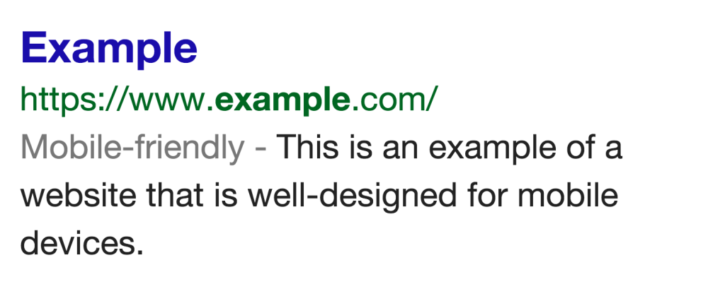
Image source: Google
This is yet another announcement by Google to provide a better user experience, and to encourage (perhaps even strong arm) webmasters to follow suit. The search giant also indicated that they are experimenting with mobile-friendliness as a search ranking criteria as well, giving website owners even more reason to invest in an effective mobile UI. Will your site earn the “Mobile-friendly” badge? Here are a few places to start:
- Test your site on the new Mobile-Friendly Test tool.
- Get more details from the mobile usability testing tool in Webmaster Tools.
- Review Google’s mobile friendly guidelines.
The Mobile-Friendly Test is very easy to use – all you need is a URL: 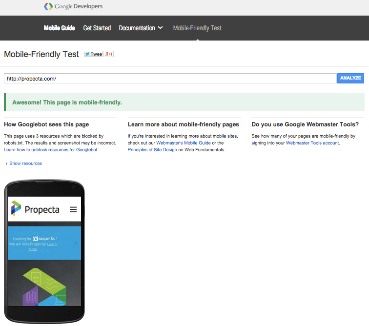 If your site is not mobile friendly you will see some basic error information.
 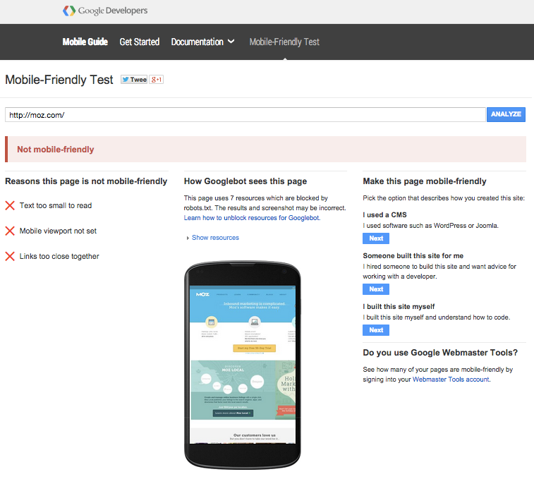 The mobile usability testing tool in Webmaster Tools is located in Search Traffic > Mobile Usability.
 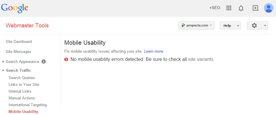 Error detail are more specific than the Mobile-Friendly Test, with the number of errors detected on the domain shown. Clicking on each error provides a list of specific URLs with that particular issue.
 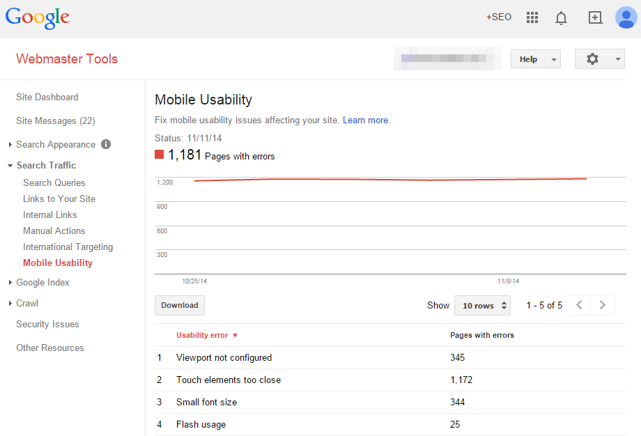 If SEO is important to your brand (and if you want to keep modern, multi-device users happy), we strongly encourage using the above tools to identify any mobile usability issues your site may have. Deploying fixes for your mobile usability problems will depend on a variety of factors. If you have any specific questions or concerns about your website, feel free to reach out to Profound Strategy.
What's Next?
Profound Strategy is on a mission to help growth-minded marketers turn SEO back into a source of predictable, reliable, scalable business results.
Start winning in organic search and turn SEO into your most efficient marketing channel. Subscribe to updates and join the 6,000+ marketing executives and founders that are changing the way they do SEO:
And dig deeper with some of our best content, such as The CMO’s Guide to Modern SEO, Technical SEO: A Decision Maker’s Guide, and A Modern Framework for SEO Work that Matters.
Related Posts
 Neil Patel’s Favorite WordPress Plugins WordPress plugins have entirely revolutionized web design. The right combination of plugins can take a developer or website to the next level. Recently, Neil Patel — co-founder of Hello […]
 Link Building is Dead: 3 Reasons to Stop Wasting SEO Resources On It Many agencies still recommend link-building as a tactic to raise a website's standing in SERPs, but many digital marketers are starting to question if this strategy is still […]
 How to Attract Buyers in an Inbound Market The marketplace has changed, and old strategies for attracting prospects aren’t keeping up. As new buyers become more self-reliant, old models and mindsets need to give way to the new […]
 Behind the Scenes at Profound Strategy’s Staff Retreat [Pictures] What a week! Last week I had the pleasure of hosting what is probably the most talented, creative, and committed team of marketers in the country. The event was Profound Strategy’s annual […]